
Oct 11 2017
It’s one thing to consistently drive traffic to your website, but it’s another thing to keep them engaged. This is where your website’s user experience (UX) is crucial.
The UX on your auto listing or dealership website should take the stress out of vehicle shopping and make it easy for consumers to find their next vehicle. If you’re finding that your website isn’t getting as much traction as you’d hoped, conversion rates are low, or overall vehicle sales are low, it may be time to reassess the UX on your website.
Here are some common UX fails we’ve found in the online vehicle shopping world. If any of these apply to your website, not to worry, there’s hope! Each of these mistakes can be corrected by making some tweaks to the design of your website, implementing intuitive 3rd party solutions, or hiring an agency to optimize your site.
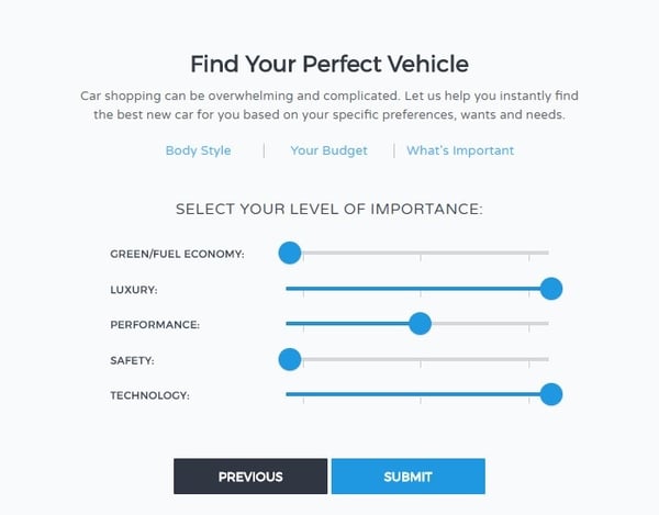
6 out of 10 vehicle shoppers are unsure of their next vehicle and open to considering multiple makes and models at the beginning of the shopping process, according to an AutoTrader study. It’s important that your vehicle research experience helps these shoppers find a vehicle, even with little knowledge of the vehicle market.
Online vehicle research tools have traditionally forced vehicle shoppers into beginning their search by Year, Make, and Model. This approach mirrored pre-online shopping, when consumers often had to choose a make and visit a dealership to get information on a vehicle. It even worked ok in the early 2000's when shoppers had less choices and had a better idea which vehicle they were looking for, with a few makes and models in mind. The way people shop online today is much different than ten years ago.
Allow your site visitors to begin their search based on what vehicle attributes are most important to them. This might be performance, fuel economy, safety, technology or other major categories. Use this information to deliver recommendations that help them sort through a daunting amount of choices and present them with vehicles that match their needs.
When site visitors land on your homepage, there should a clear path or two for them to take. A user-controlled experience is great, but too many paths to choose from can be overwhelming and will distract your prospects from taking the actions you want them to take. This will result in fewer conversions and ultimately lower vehicle sales.
Without disclosing the dealer, here is an example of a site with way too many paths to take:
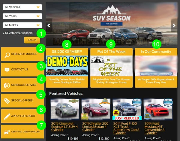
10 calls to action, as well as featured inventory, all above the fold of your homepage is too much. While each of these paths is valuable on a dealership website, they shouldn’t be crammed into one section with all CTAs having the same color and style.
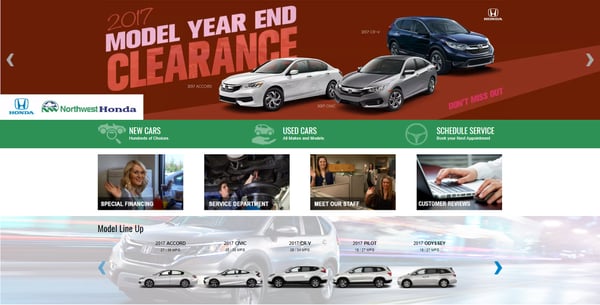
Here’s an example of a great dealer website with the different paths split up between sections:
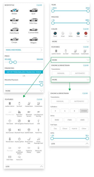
Once your site visitors have landed on the SRP, they will likely want to narrow down the results even further with granular filtering options. Each vehicle model has many options to choose from. Your site should reflect this.
Allow shoppers to filter beyond price range, drive type, and other basic details. Some advanced filtering options might include seat upholstery, connectivity, autonomous safety equipment, etc.
Carvana does an excellent job offering a nice selection of filtering options to support the modern consumer. The screenshots below show all the filtering categories, as well as the “Features” and “Engine & Drivetrain” sections fully expanded.
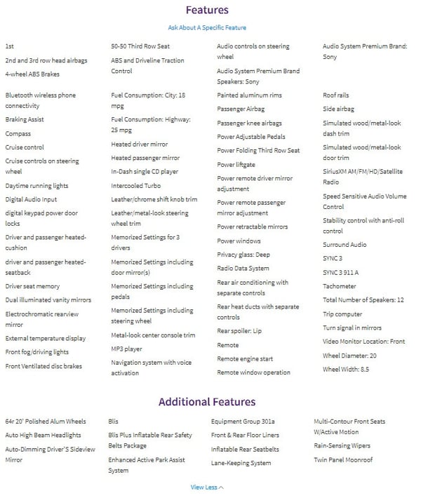
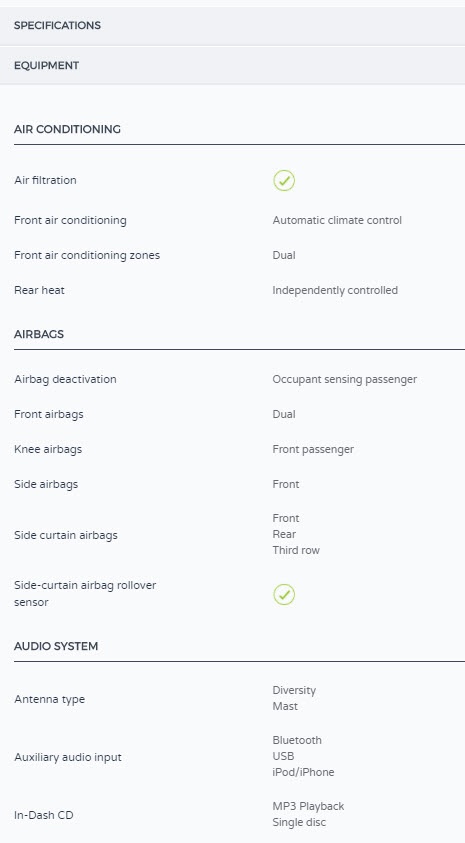
Do your VDPs have all the vehicle specs and features listed in a few lengthy columns? Break the vehicle details into a logical hierarchy of categories so users can sift through and find the features they are most interested in. For example, if the shopper cares most about technology, they should be able to scroll to a technology section with subsections broken out by connectivity, advanced safety features, autonomous features, and so on.
Vs.
What’s the difference between Subaru EyeSight® and Honda Sensing®? Sure, you might know the difference and maybe some car enthusiasts would, but your average site visitor will not. Marketing lingo or jargon
Make sure the comparison tool you offer on your website has normalized vehicle descriptions that match comparable technologies together without the confusing marketing names. The tool should also highlight major differences between the various vehicle models to help simplify the experience for your shoppers.
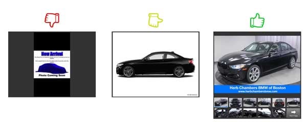
Real vehicle photos are ideal when looking at a dealership’s inventory. Even stock photos get the job done as a place holder until the real images are added. However, little to no imagery is a problem. Consumers expect to see a nice collection of real photos, not 1-2 stock photos or worse, a placeholder. Your prospects will move on to the next piece of inventory if there aren’t great supporting images.
Websites providing tools for the initial stages of vehicle research are probably working with virtual inventory, in which case, stock photography is a great option. Whether you are supporting vehicle research with virtual inventory or listing real inventory, make sure you have a collection of images for each vehicle.
46% of today’s consumers use mobile devices for part of the vehicle shopping process and 14% of these consumers use them exclusively, according to the same AutoTrader study mentioned previously. Vehicle research doesn’t end at the dealership either. Many shoppers continue their research right on the dealer lot, as they compare pricing right from their smartphones.
Your mobile experience needs to be just as good as your desktop experience, if not better!
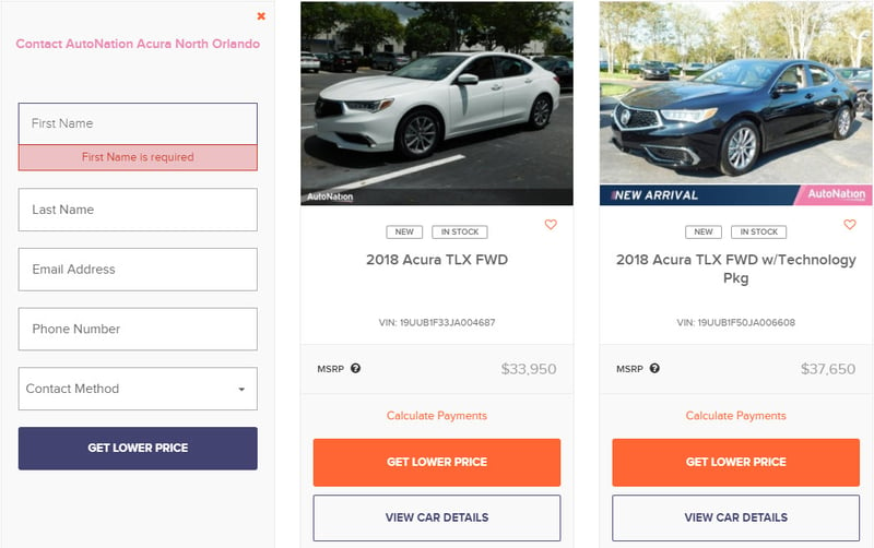
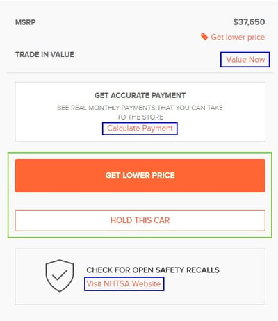
Similar to point two, there needs to be one or two clear calls to action. Too many offers can get distracting and deter your shoppers away from the ultimate goal – submitting a lead and purchasing a car. Take your shoppers though a clear path with a couple relevant calls to action at each stage of the funnel. AutoNation does a great job prioritizing their offers, shown in the following examples.
On their SRPs, they have two primary CTAs for each piece of inventory (Get Lower Price or View Car Details) and when selecting "Get Lower Price," a form appears in place of the vehicle of interest rather than pushing them to a landing page:
On their VDPs, they also have two primary CTAs (Get Lower Price or Hold This Car) along with some secondary offers that they have not placed as much emphasis on.
Nothing is more off-putting for a website visitor than a slow page load time. According to Google, over 50% of mobile users will bounce from a site if it takes longer than 3 seconds to load. And this is probably not much different for the desktop user. That is not much time at all!
Mentioned in the same Google article, “Our analysis shows that the automotive, technology, and business and industrial market sectors have the most room for improvement.”
Speeding up your site pages will go a long way in keeping shoppers on your site. You’ve worked hard enough and spent enough money to get them in the door. Don’t let a slow website get in the way. Here are 10 ways to speed up your website in this article by Crazy Egg.
Finding flaws in your work can be a tough pill to swallow. You’re not alone though. Every business’ website is a work in progress, ours included. Consumers continue to evolve and their expectations change.
Consider using some of these common fails as motivation to deliver the best user experience possible that will engage more potential customers.
