
Aug 3 2016
There are quite a few car insurance quote comparison websites for consumers to quickly identify the most affordable insurance premiums in one place.
Given the number of websites available for comparing car insurance quotes, it’s important that your comparison site offers the best user experience possible to help stand out from the crowd and keep your visitors engaged.
Here are a number of user-friendly features your quote comparison site should include.
For consumers who have their license plate number handy, requesting a quote by plate number is an efficient way to generate an accurate insurance quote without jumping through all the hoops of manually plugging in vehicle details and driving records.
This is a great feature for all car insurance quote comparison sites to offer their site visitors. You’re already providing a solution that allows consumers to find the best fitting insurance provider, why not take an extra step and provide site visitors with a means of quickly generating quotes.
Insurify, a car insurance quote comparison startup company based out of Boston, has embraced this concept. They have a license plate lookup service in beta right now that allows vehicle insurance shoppers to text a picture of their license plate to Insurify’s virtual insurance agent, Evia.
Another great way to speed up the quoting process for consumers, as well as increase the accuracy of your quotes is to provide a VIN lookup option.
Rather than requiring car insurance shoppers to plug in year, make, model or any other details about their vehicle, giving the option to obtain various quotes using their VIN number can be much quicker when the VIN is available.
Not only is VIN lookup sometimes quicker, but will ensure more accurate quotes. It’s easy for vehicle owners to mix up details about their car, including the model year or trim. Though the trim can’t be decoded 100% of the time, an advanced vehicle data provider is often able to pull in additional data to help identify a high percentage of trims. This is valuable for identifying installed/optional safety features that would contribute to insurance premiums.
Integrating vehicle images into your insurance quote comparison website and/or applications is a nice addition to the user interface (UI) while providing a means for consumers to verify that they’ve selected the correct vehicle for quoting.
Oddly enough, the majority of car insurance quote comparison sites do not offer this feature.

The majority of today’s consumers are spending a significant amount of time on mobile devices. Google has been talking about a mobile-first strategy for quite some time. It’s important that your website is not only user-friendly for desktops, but also for mobile.
Tools like license plate and VIN lookup become even more valuable for mobile users that are looking for the most convenient way to obtain car insurance quotes.
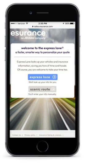
Esurance allows users to choose one of two paths, express lane or scenic route, which is a nice feature for mobile users who prefer not to manually enter a bunch of information.
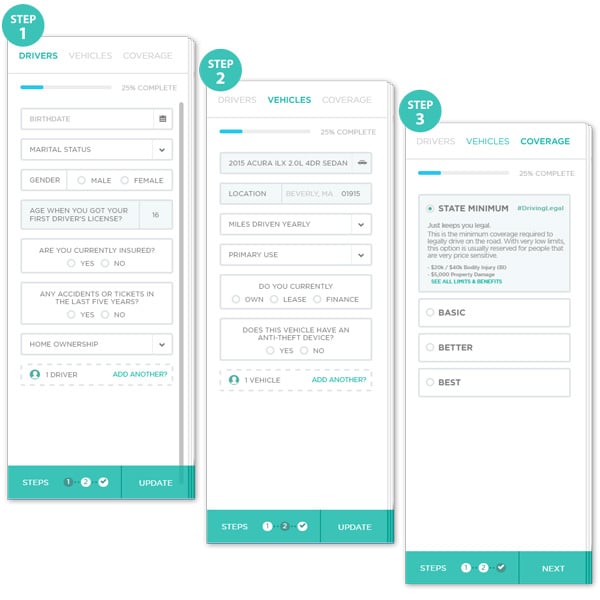
Vehicle insurance plans can vary quite a bit given that each driver has a unique use case. A great way to solve this challenge is by providing an intuitive quoting experience that allows consumers to quickly fill out their unique information to generate the most accurate quote possible.
The Zebra has created a great vehicle insurance quote comparison experience that allows users to engage with their site and accurately identify key variables (in 3 simple steps) that will determine their vehicle insurance premium.

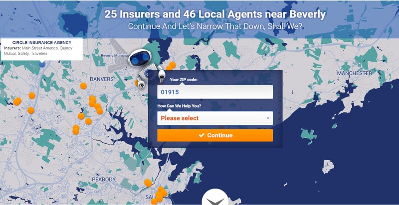
For the car insurance shoppers who would like to explore their options based on the location of insurance agents, a feature that helps quickly identify all the insurance providers and agents in the area would be a great addition to your website’s user experience.
EverQuote displays a map write on the homepage that marks out all the providers and agents within the region based on the zip code provided by the user. When hovering over the map markings, basic information about the agent is provided –including the providers they work with.

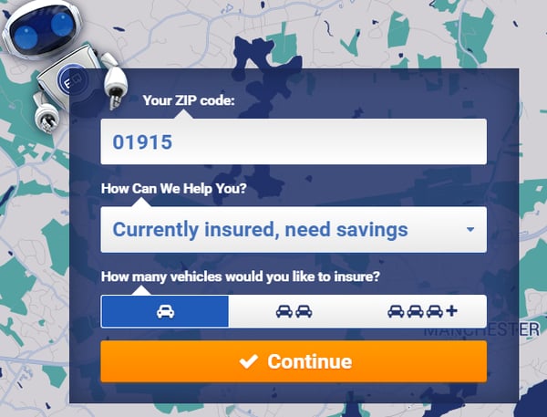
There are only a handful of reasons why your site visitors are looking to compare car insurance premiums. Providing consumers with a clear path to take on your website would both improve the user’s experience and increase the value of leads generated for the insurance providers and agents.
As a second step for comparing quotes on EverQuote site, they’ve given users the option to choose from four possible scenarios, as follows, to help better cater the process.

By asking the simple question “how can we help you,” EverQuote is able to identify the lead’s needs and pain points to better cater the rest of the quote comparison experience.
Consider adding some of these features to your car insurance quote comparison site if they don’t exist already. Consumers are looking for user-centric experience, so provide what they are looking for!
What features have you found are most valuable for your website visitors? Please share with us in the comments section below!